
Zoom for Education
In this project we worked to create a Zoom redesign specifically aimed at Zoom for educational purposes. This project consisted of conducting a contextual inquiry to create personas, designing a low-fi prototoype, a hi-fi prototype, and conducting usability testing.
My Role
-
Team member (3 person team)
Methods
-
User Interviews
-
Persona Creation
-
Contextual Inquiry
-
Prototyping
-
Wireframing
-
Usability testing
-
Figma
Time
-
January 2021 - May 2021
Introduction
Zoom was observed to be difficult to navigate due to many hidden features behind large menus and an overload of information.
Our goal was to provide a solution to these problems by:
-
Restructuring menus
-
Creating a more intuitive control placement
-
Creating more customizable screen views
-
The creation of new controls that can be used for educational purposes

Who is this for?
Students, Teachers, Interpreters, Captionists, Zoom's Product Team

What are their concerns?
Getting set up for class and Zoom getting in the way of the learning experience

What are their goals?
An improved education experience, easier navigation, smooth communication.
Our Process
Contextual Inquiry
Create Personas
Lo-fi Prototypes
Hi-fi Prototypes
Usability Testing
Contextual Inquiry
In order to perform this contextual inquiry we completed several steps.
-
Planned the goal of the interview and constructed questions
-
Interviewed both instructors and students about their needs from Zoom
-
Before each interview we watched the participant using Zoom for a class (whether they instructed or participated)
-
-
Created transcriptions and notes from each interview
-
Created an affinity map using freehand
The affinity map was created using the ideas from the contextual inquiry. The blue notes came from student interviews and the yellow are notes came from the teacher interview. The purple notes represent the groupings of those first layer categories, and the green notes represent larger categories that categorize purple notes.
You can examine our affinity map more closely at: https://projects.invisionapp.com/freehand/document/WpsboCXNa
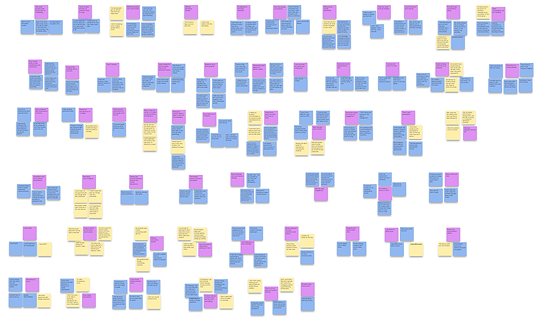
A Zoomed out view of the affinity map's bottom categories

A Zoomed out view of the affinity map top categories

The high-level notes that we found with the affinity diagram.
Creating Personas
The next step of our process was to create personas based on our affinity map and interview data. Based on our interviews, we created a primary persona and two secondary personas that we used to guide us when we created our designs.
Primary Persona
Sofia was created based on the experiences of the majority of the students that were interviewed. We made sure to especially highlight COVID-19 related issues, as this was a major talking point in user interviews

Secondary Persona
Tori was created to represent the instructors who use Zoom and highlights issues that many instructors faced while using Zoom.

Secondary Persona
Because student learning is diverse, we needed to consider neurodiversity of individuals as well. Dan was created based on interviews with students with ADHD.

Creating Lo-fi Prototypes
We examined the concerns that we discovered during our contextual inquiry in order to create solutions and address the most common user problems.
This image demonstrates the view of a student using our Zoom redesign.

Here is a video that shows the redesign from an instructor's perspective.
Creating Hi-fi Prototypes
Our next step was to show our Hi-fi prototypes to users for some informal feedback. We showed students and instructors our designs and asked them questions to gauge whether they liked the features, the placement, and whether buttons were intuitive. After taking their critiques in consideration we came up with these hi-fi prototypes using Figma.
The Student View
The Instructor View
Usability Evaluation of the Prototypes
The next step was to perform usability testing on the product to verify that our changes were well received. Due to the scale of the project we did not have time for extensive testing, but we were able to run three short usability tests.
Metrics
We asked students questions in order to gauge their feelings towards the redesign and look for any usability issues. We used the system usability scale to evaluate the prototype after participants were asked to perform basic interactions. The system usability scale is pictured below.

Results
Of the three usability tests that were performed participants scored our system as 80, 90, and 95. This averages to 88.3.
Features that participants enjoyed include: The discussion desk before the class start, the scrolling through participants, the pink accent, the presenter function, and the chat view.
Features that were missing or confusing: Some participants wished there was a way to switch the order of the people, have a go back to main room button on the desks, and have the screen share say teacher sharing. One participant also expressed the wish that there was a feature to hide your face from everyone except the teacher.
Problems with Zoom that were addressed by the redesign include: Groups are more intuitive to assign, this design makes Zoom feel more like an in-person classroom with the desk feature, the chat was much better, and the redesign is much more visually appealing.
Reflection
The usability testing revealed that while we addressed many of the issues we aimed to address with our redesign, such as improving the overall appearance and social functions of Zoom, there are still issues that could be addressed, including adding new features. If this were a situation where we had more time we would go through the design cycle again and address the concerns revealed in this usability test.